The design of your website is very important. It isn’t only the case so that you can show it off to your friends and associates. If you derive any money (or would like to!) off of your site, then that design is important for the success of your business. After all, what types of products or services are you going to be selling if your visitors cannot even last on your site for three seconds? This is the reasoning behind the use of the word ‘conversions’ in the title. The first step toward getting those conversions, whether it is a sale, a new subscriber, or a repeat visitor, is to get the basics down for that site design, or re-design. Today we are going to look at some of those basics and give you some ideas.
The Importance of Fonts in the Design (and some ideas for you!)
Fonts are not just for text anymore. With the advent of easier access to fonts, the sky is the limit. Also, the font is a part of the design process. It helps to create the cohesion and appeal of your site. If you feel like you are a numb nut when it comes to deciding on which font to use (and especially which combination!), you could take the time to look at what the designers are doing and see if that inspires you.
There is a tool that is essential before doing your research. It is a free tool and it is called WhatFont. It is available as a bookmarklet addition to your browser, and it is also available in other versions. All these different versions are available from the link. Now that you have your WhatFont tool, you can visit the following sites along with me, and we can look at the fonts, as examples (hint hint 🙂 ).
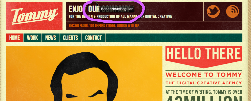
The “Branding” Font: Tommy’s
The font for Tommy‘s site is definitely a graphical component of the overall brand. It fits right into the graphics as if it is not even text anymore. It gives that nostalgic magazine or newspaper print design feel. It is a great example of integration in design. This site uses Bebas Neue and Arial fonts. The Bebas Neue font is listed as freeware, able to be downloaded and used for personal or commercial use (according to fontsquirrel.com). As you can tell, it works well with the Arial font that should already be installed on your computer.
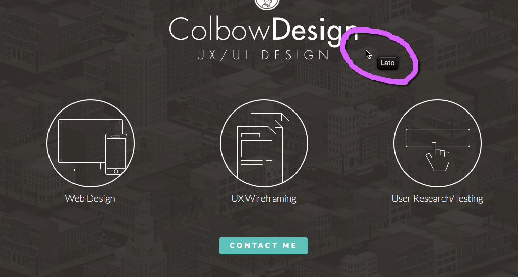
The “Simple” Font: Colbow Design
The font for Colbow Design‘s site is a nice clean font with smooth lines. This fits well with the simple line drawing-based graphics, creating another well-integrated design (see a pattern here, with fonts and graphics?). This site uses Lato, a free Google Font. It is also a very popular font used in many sites. It is just classic enough that it doesn’t look “different” (in an unusual way), and yet it is unique enough that the sub-conscious doesn’t immediately classify it as a system (or “boring”) font.
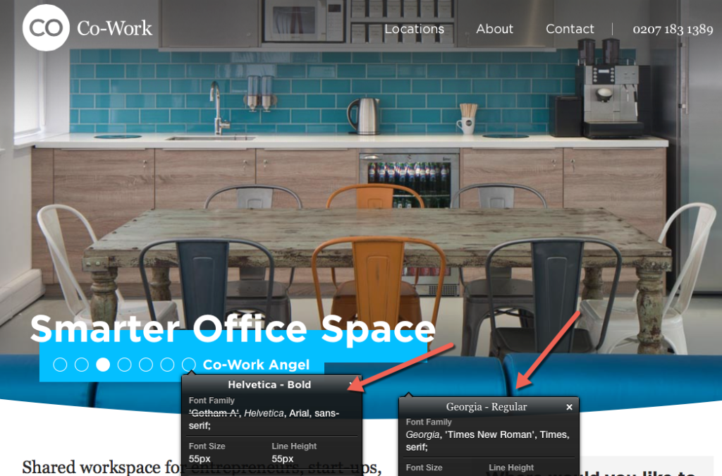
The “Accessible” Font Combination: Co-Work
The fonts for Co-Work‘s site are accessible, meaning most people have them on their computer. This is appealing if someone does not want to mess with font installation. My first thought was that that was just not complicated or “designer” enough, but in looking at the site, the designers did do an impressive job combining these two unassuming fonts. This proves that you do not have to be fancy, and you do not have to have a large “font budget” to create something fun and engaging. Of course, the graphics help, as well. This site uses Helvetica and Georgia fonts, which should come with your computer.

The “Creepy” Font Pairing: Kansas City Creep Fest
The fonts for Kansas City Creep Fest‘s site are, well, creepy. You can’t have an article about fonts without having one or two that look like they were made for the Halloween holiday. It isn’t as much about Halloween as it is a demonstration of just how unique fonts can get. This site is using Google Fonts, Homemade Apple, and Copse. Again, these fonts are helpfully accessible (free) from the Google Font people. Another example of a really unique, memorable font includes the Wolf’s Bane, used on the DragonBlogger.com site. Wolf’s Bane is listed as “donationware” on the dafont.com site. Also, I just happened to know what the font was (thanks, Justin!), so if you try to use the WhatFont tool, it may not register what the DragonBlogger font is because most of the time it is in the image/logo. Keep this in mind as you use the WhatFont tool that it may not always tell you what some of the unique fonts are, because they are often embedded in images. However, you can use the tool to find the font for things like text-based navigation.
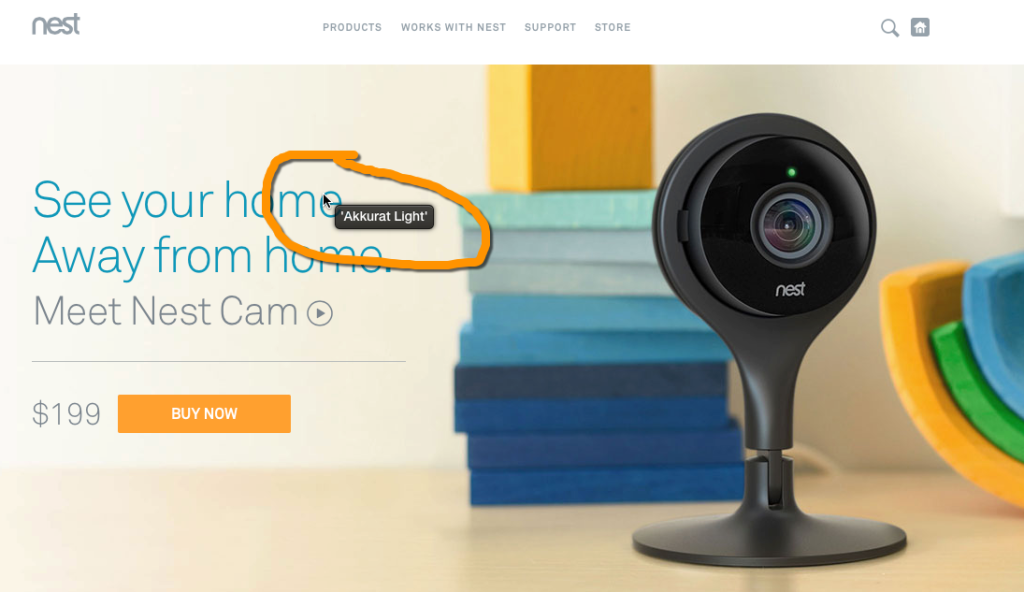
A “Clean” Font Combo: Nest
The fonts for Nest‘s site are clean. As you noticed with all of these examples, the designers have done an excellent job of finding fonts that fit well with the graphics, creating a consistent theme. Nest is no exception to that. Their clean graphics fit with these fonts. The way that they create the uncluttered, yet artistic, look is a perfect fit with the fonts. This site uses Akkurat and the Fuller Sans fonts.
Unfortunately, both of these fonts cost money. However, there is another option. If you find a font you like on a web site, using the WhatFont tool (or any means, really), simply put that font name in quotes in Google and then add the word “font” and the word “alternative.” If anyone has found an alternative for that font, you will find a link to it. While there isn’t an exact match alternative for Akkurat, the system font, Geneva, may be a viable alternative. This would especially be the case if cost is an issue. For Fuller Sans, an alternative would be the Google font, News Cycle. Again, it isn’t exact, but it may suffice.
Here is a side-by-side example of Fuller Sans ($$$) and News Cycle (free):

Color Scheme
In the same way that we see the fonts working with the graphics and working with the overall branding, you will want to watch your color scheme. Ideally you keep your colors consistent with your logo. In cases where your logo has two colors, you may want to consider adding a third color, but ensuring that it is complementary. It is also possible that you only want one color, to really cause a “pop” and that the rest of your site is black and white. And, it may be possible that you really are “rainbow” oriented and use every color. Whatever it is that you are doing with your branding, be consistent. If it really is a rainbow look, then ensure that there is some sort of pattern, so that people “feel” that consistency. For example, for rainbow colors, you would want to use the rainbow progression of color, “Roy G. Biv,” which is: Red, Orange, Yellow, Green, Blue, Indigo, Violet.
Advertisement Placement (and Monetization Considerations)
First, let’s talk about monetization considerations and how that relates to your site design. First off, if your monetization is 100% related to the selling of your products and offering your services and you never “advertise” your specials, or products, or services, anywhere else on the site except the page where your clients pay, then this section may not apply to you at all. Most of us, however, at least advertise our own stuff, even if that is a case of prompting the visitor to subscribe to our newsletter. So, let’s continue reading, shall we?
There are two types of monetization options that we want to consider. The first one is not really what we think of on this topic of design, but I will explain. The second one is a little more obvious.
- Membership Options; and
- Advertisements.
Monetization Via a Membership Option
The reason that I include this in a design article is because the more that you can monetize through membership options, the less actual advertising space you have to use. It is true that you may want to use membership options AND advertising to maximize your monetization, but I’m suggesting a bit of balance here. (More on the advertising overkill in the next section.)
Since a picture is worth a thousand words, let’s use an example of a site that uses membership and advertising in a balanced way. That site is IMDB (Internet Movie Database). Since Amazon took over this site, it has taken off, as far as that design! But, hey, it is Amazon. What do we expect.
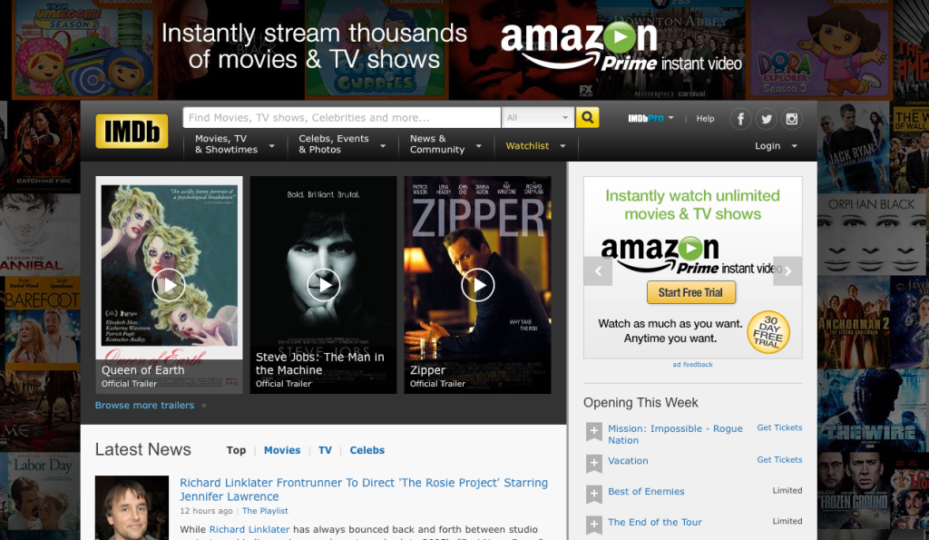
IMDB, for the most part, advertises themselves, but I call it advertising because regardless of “who” or “what,” it is still advertising.
When it comes to advertising, this site takes you right to the limit, as far as the annoyance level, of the ads. Yes, there are some layers that may pop up on your screen and interrupt your reading, but it seems like it is not as excessive as other sites, which is why I say “right to the limit.” Also, IMDB offers their IMDB pro membership, which adds to their monetization. What I am suggesting here, based on the IMDB experience is to go ahead and add your advertising, but then ease back. For example, if you add ten advertisements, pull two back off the site. You do not want to overwhelm your visitors so that they leave without buying anything. Augment your earnings by offering a membership, if that fits with your business. For example, maybe you have an awesome blog. Offer the normal free content, but for those special articles that are more like Kindle ebooks, offer a membership access to read the full article. This may be something to add to your list later on, after you have some time to think about it, but it is a way that you can ease back on that advertising, and most importantly, not annoy your viewers into leaving the site without any purchase at all.
The Annoying Advertisement Approach
Obviously, I am recommending the opposite of how we labeled this section. The idea is to NOT annoy your readers. An example of a site that takes it too far, in my opinion, is Examiner. Sorry, Examiner, just calling it like I see it (and experience it). I like the content on Examiner. I see article headlines there and want to click on them. I intentionally resist the urge because I do not like the feeling of being annoyed and appreciate peace more than a need for the headline. Instead, I look at the headline and then search for it on Google and click on another site to get the news.
If you are wondering why it is that I am on Examiner and then intentionally click off of the site, that is easy. I am an Examiner, so I need to log in to publish my articles. I am already there and in the process of just adding an article that I have likely composed offline, adds are popping up right and left. No matter how fast I process a login, clicking on the dashboard, and a “paste” function, I cannot seem to escape the ads. While it is possible that I am just an impatient person, and there is nothing wrong, that is fine. Go ahead and monetize to the same level as Examiner. However, there are a few of us out there who will avoid your site like the plague just because it is too distracting and we become disinterested in anything you have to offer us, with that amount of advertising.
Now that we have touched on two different monetization options and how that relates to the design of your site, and more importantly, keeping those visitors, let’s close out with a detailed infographic prepared by savrn.com. There are some very helpful insights and tips that you can apply, just looking at what they offer you:

