If you read our prior article about magazine style blog design, you hopefully got a good overview of what magazine style design on the web looks like, and examples of sites that incorporate it well.
But analyzing an existing site’s successful magazine style implementation is much easier than taking your own blog and applying a magazine layout to it. It can be overwhelming to even begin, let alone determine how to balance your numerous components into something that services your readers and helps benefit you as a blog owner.
To help stimulate your creativity and get ideas on how you might structure your blog with a magazine approach, we’re going to deconstruct a popular celebrity gossip blog and rebuild it into more structured, magazine layout.
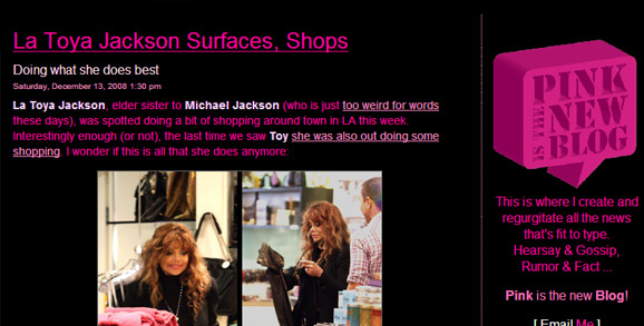
Pink is the New Blog is a frequently updated, conversational and timely blog about celebrities and entertainment. Although its current two-column layout is common for blogs and can allow readers to scroll through celeb news quickly, a restyling of the blog—especially a more structured and ineteractive home page—could benefit both the blog’s owner (through better ad placements and increased clicks to deep archives) and the audience.
Let’s peek at the current layout:

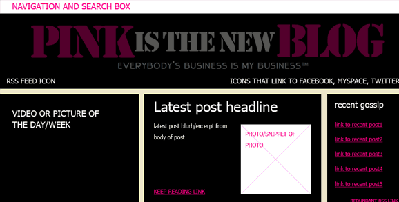
The brand design is lively and fun—appropriate in mood for the subject matter, audience and the writer’s tone of voice. But take a look at what happens if we change the home page to fit into the wireframe below:>
 (Be sure to click to see the full magazine layout)
(Note this wireframe clearly isn’t branded or using Pink’s design elements. Trent, Pink’s owner, could keep the same branding and graphics approach, but kick it up a notch with a layout that serves him and his readers better. We’re looking solely at structure, hierarchy and a basic magazine wireframe here, and yes, we know that in terms of text alignment and polish, it needs work).
What does this new approach do for both the owner and the blog readers?
Leverage timelinesss
Design driven by content is one aspect of magazine design we discussed before. In brief, not every blog is a good candidate for a magazine style layout. Those that are frequently updated will find a magazine structure a more natural fit than blogs with infrequent posting. Pink is a great candidate for a magazine structure because of daily—sometimes multiple times a day—postings. Our structure above would let Pink showcase its frequent updates in a more obvious and helpful manner. Readers can quickly scan the page—without needing to scroll—to see the latest and greatest. A constantly changing front page may encourage more repeat site visits and improve Pink’s exposure over time.
Give readers more choices quickly
By showcasing headlines and blurbs of not only the most recent gossip piece, but the other 5 prior ones, readers can scan quickly to determine what they haven’t read and click through accordingly.
Inject new technology and leverage content
Video tech is hot. Celebrities are hot. Marry the two, and you have a combination for a blog that’s made to stick. Even if the video doesn’t change daily, readers new to Pink will be drawn in by the featured video, and loyal visitors may find it a welcome addition to watch a celeb video on the same site they normally read. Different people are attracted to different content—offering video in a prominent location helps provide alternative content and position Pink to look more resourceful.
By placing a section for “latest releases” Pink can offer quick, relevant content for people who trust Pink for information about upcoming movies, CDs and books. The potential bonus for Pink’s owner, Trent, is better affiliate commissions on these releases because of their more prominent placement.
Better ad placements
This leads us to ad placements in general. Trent could sell one (or several) home page advertisements at a premium rate above the cost for an inside page advertisement.
More clear accessibility of archives
A crazy, long drop-down menu currently houses Pink’s archives. This beast of a list can be wrangled with a box and javascript solution that shows archives on a year by year, then month-by-month basis, but hides the other years and months accordingly. (See xxx site for an example of this sort of javascript archiving). Implementing category archives into both a “quarterly hot category” section as well as a general tag cloud targets a variety of browsing preferences and makes it easier for people to browse topically and by popularity, which is particularly relevant on celebrity and entertainment blogs.
Improved flexibility
We don’t know Trent’s goals as a blog owner. It’s possible a lot of what we’ve suggested be highlighted is not information he feels is relevant or where he’d like to focus. But this revised home page structure gives Trent a variety of options for highlighting his chosen content in a manner that’s easier to digest. If he feels site testimonials shouldn’t be given a home page spot, he could swap that out with a photo of him and Madonna. Or, if over time new types of social networking communication methods become popular, he might consider swapping out the “top 5 fall categories” section with something related to that network.
This example just takes a look at Pink’s home page. His inside pages could take on a variety of layout approaches. A “single” entry (with comments) could continue to utilize the current two-column layout style. A monthly archives page could combine a more modular, magazine approach but without as many sections as this home page layout shows. A category archive page might have at least one strong visual that relates to the category name to bring in more imagery into the site.
If your blog contains lots of current and past info, like Pink is the New Blog, and there’s opportunities for you to better leverage ads, videos, social networking information and other valuable content, you might weigh the benefits (as well as costs) of restructuring into a magazine layout design to better serve your readers AND promote your site in a refreshing, and potentially more successful manner.


[…] Deconstructing A Magazine Layout: a Brief Case Study and Example A Good look at how a magazine layout is put together […]
lovely pink color, pink site is really a good fashion blog
hi, An appendix provides brief information on Web color, hexadecimal color, … Weinman is a one-woman graphics factory turning out essential web-design guides!
Deconstructing A Magazine Layout: a Brief Case Study and Example. Jan 2, 2009 … If you read our prior article about magazine style blog design,