What makes a good landing page?
This is a common question that most start-ups find themselves asking when preparing to launch their site. Because they are small businesses with limited funds and resources, there are no expert marketing teams and $100 per hour graphic designers to answer it for them. They have to rely on their own creativity, ingenuity and the basics that this question will teach them.

It doesn’t help that most people have a different set of requirements for the perfect start-up landing page. There is no real set standard, and what might work for someone else might not work for you. This depends on what service or product it is you are attempting to sell. It affects the navigation and overall layout because of your site and user’s needs.
Does that mean you can’t find an adequate reply to the query? Luckily, no. There are a couple of ways to make sure you make the best choice in your landing page design.
Look At What You Need
Start out by looking at what it is you need in a landing page. Will it be a simple introduction with a social networking sign up option? Maybe something with a full list of products, features and contact information? Just a quick stop before moving onto the main site’s sign up documentation?
By knowing what you are required to provide to give the visitor
what they need to accept your offer, you are halfway there.
Look At What You Want To Say
Next, think of all of the information that is most important about your company. Think of how to explain the product or service, the mission statement, and the call to action. Keep in mind that this is not an About page. So the shorter the summary for these elements, the better.
You are trying to use the landing page as a quickfire way of sparking the visitor’s interest. There is nothing worse than a start up that fails to immediately explain what they are, and what they do.
Look At Others’ Landing Pages
Finally, take a peek at other landing pages that have been successful.
ZenDesk
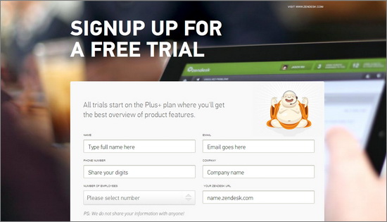
Zendesk has changed their interface from the original landing page they had. But I like this one even better. A stylish background image showing a tablet is the only real adornment. Then the sign up is presented in a large, white box in the center with a cartoon picture of a smiling Buddha. Which takes care of the connection to their business name. Super simple, with unobtrusive links to their privacy policy and terms of use.
Tweetdeck
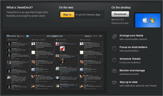
I am always a fan of websites that use dark layouts, but not black. This one uses a dark gray background for their landing page, and a similar style for the rest of their imagery. All that breaks it is the white of text, and the occasional blue touch of links and the official Twitter logo. You have a screenshot of the service, to help illustrate the purpose of the dashboard. Otherwise, there is just a small list of features, the download link with an image of Apple and Microsoft logos to show both are compatible, and sign in and ‘follow’ buttons.
DropBox
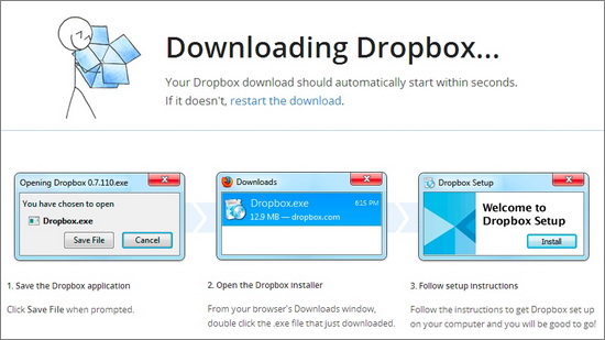
The moment you go to the page of the download link, it gives you the standard permission pop up to begin install. I think this is very clever, as not many sites utilize this (somewhat presumptuous) tool. It can usually be assumed that visitors to this page have already chosen to get the program anyway. But the main landing page is even more direct and minimalistic. There is nothing but a small video, represented by a faded blue play button, and the download button. Scrolling below will show you a discreet menu that looks separate from the rest of the design.
Mint
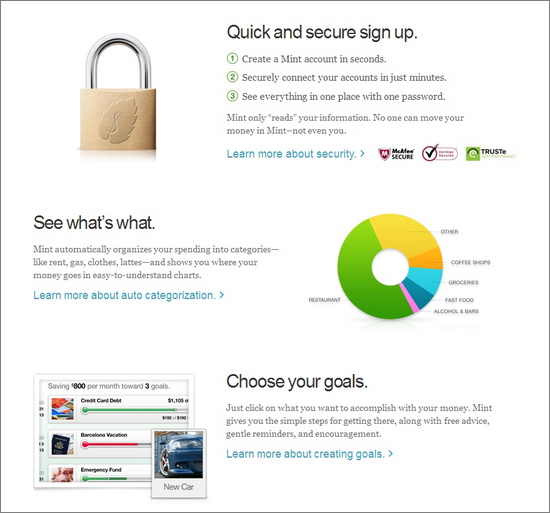
Mint is a good example of a site with a higher burden of explanation than most. Because it is asking for financial account information, they set about showing exactly what they do, how they do it, and how you can access this service. Along with a couple of images and promises about security, and links to other pages explaining more in each section. But they manage to present this all without being too wordy or cluttered.
Do you have a landing page that you think provides an example of how start-ups should proceed? How about one that is a major “don’t”? Let us know in the comments.
Image Credit: 1.





Really enjoyed the post especially because the post is targeted to small businesses. But do you think that ZenDesk, Tweetdeck, DropBox and Mint are small businesses, I don’t think so. These are big names funded and backed by many investors and companies. They are full of resources and teams to manage their online marketing, optimization, promotion and landing pages. What about a very small, local and bootstrapped company? What kind of marketing strategies would be effective for them which suits the budget as well as help them to grow?
Hello there. Thank you for sharing your thoughts. I believe that in this article, the author is using these examples, by big businesses, to show small businesses some ideas that they can implement for free. It isn’t like the author is providing the link to the designers that are hired (assuming it is third party) by these companies so that small businesses can see that they cannot afford them. Actually, I believe that for this design it would be affordable, from what I know. The point that the author is trying to make is saying, “Hey, look what we can learn from the big guys. Then, we can apply what we learn, at no charge, to our own sites.” Hope that helps to clarify. This is a common practice, to learn by looking at other examples.