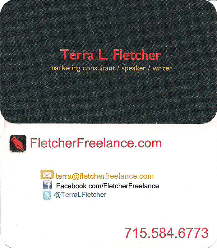
The first thing many entrepreneurs do as soon as they come up with an idea and a company name is have a business card printed. There’s something “official” feeling about getting your own business card when you work for someone else, too. But you may wonder if you still need a business card in 2012. With all the electronic options for communication in our digital world, should you still have a piece of paper to hand out with your name and contact info?

Yes. A business card is both tangible and valuable. The secret is making cards effective. Your card needs to look like “you,” your brand. Most card exchanges take place face to face, giving the receiver the opportunity to make an association with your face and your brand. This should really make an impression. The card should not blend in to the stack of cards already on the recipient’s desk.

Tips for Attractive Cards
Keep it simple. Your card should look current, not crowded. Sure you’ve got 22 social networks, three phone numbers, and seven email addresses, but Please do not list them all on your card. Pick the essentials, leave out the rest. If you don’t have a storefront, do you need a physical address? If your website links to your social media accounts, do you need them on your card? (I list a few of mine, because social media is a big part of what I do.)
Chose color wisely. Most cards are white or cream. Please don’t use white or cream (ok, the one below is cream, but it is an image)! Full color and photographs add visual interest. My card is black. I love black business cards because they’re relatively rare. Ok, I’ll verify this… Of the 300 cards I currently possess, 12 are black. (I designed four of them.)
Think of your card as you would any first impression you hope to make, a favorable one. Is your business trendy, techy, traditional? Does your card reflect that? The more artistic industries can get away with using unusual shapes and materials for their cards, but the card still needs to fit in a wallet, card case, or pocket.
Most importantly, always have your cards with you. Always! Get in the habit of asking others for their cards. And hand out your own. Want my two cents on your card? Link to it in the comments or email it to me, terra(at)fletcherfreelance(dot)com.