Blogs designed with a magazine layout are a pretty hot design trend. This design approach also has long-term prospects as a viable layout and user interface strategy, particularly as mammoth, older blogs require new ways to better present and organize their arsenal of content, and as other blog owners incorporate new models of content into their sites.
But not all blogs are created equal, and not all blogs are great candidates for a magazine layout style. In fact, a vast majority of blogs, particularly personal blogs, and those that aren’t updated frequently, are best served by the traditional, 2 or 3-column scroll down approach. When considering a new layout approach for your blog, your content should really drive the form (layout methodology) you choose.
Pros and Cons of Magazine Style Layouts
One of the driving forces behind the magazine layout approach on a blog is evolving technology. This ranges from new ways of delivering content such as video, photo streams or widgets onto a site, to the injection of flexible, modular theme systems such as the Revolution magazine theme series and Gridline magazine theme series (for WordPress as a platform). Other content management systems, such as ExpressionEngine, make it increasingly easy for a blog to embrace a more modular, magazine style approach instead of the traditional, two-column-content-on-left-sidebar-on-right standby.
Pros of magazine layouts
- You can provide a more comprehensive user experience if your blog has a lot of content, or if you update frequently, and you’re providing great visuals, videos, or cross-promoting products on an ongoing basis.
- A magazine layout can potentially avoid some of the old “below the fold” usability issues, but as monitors scale upward, this becomes less of an overriding factor.
- If you’re writing/selling to a more sophisticated, tech-oriented, or design-oriented audience, a properly executed, finely designed magazine style approach can improve the trustworthiness and reputation of your brand and position you to look more forward thinking and organized.
- If you’re leveraging alternative content like video, podcasts, Twitter feeds, photo streams from Flickr and providing a wholly interactive experience, a magazine theme is going to make your life infinitely easier from an organizational point of view, and your end user will likely be more engaged in your site, less likely to bounce away quickly, and return to your blog more frequently for a quick glance at your latest interactive updates.
- A potential SEO boost with more links and varied content on your front page that get spidered quickly, versus miles worth of scrolling that gets lost in pagination.
Cons to consider
- Magazine style is NOT for everyone. If you post fewer than three times a week and aren’t supplementing those posts with any sort of microblogging updates (Twitter, Tumblr, Flickr photos) or video and photos, a magazine layout can cast more negative emphasis on the fact that your blog isn’t frequently updated.
- Complexity of installation and design can be an issue. While you can buy one of the pre-packaged magazine themes for WordPress, for example, any customization beyond that may take a higher technical knowledge of php. If you’re attempting a magazine style yourself from scratch and are lacking in the design skills department, you may find the complexity of balancing sizing, proportions, hierarchy, etc. too difficult to execute properly.
- Cost. If you want to go the magazine layout route, but need to outsource the design and programming work—even if it’s a modification of an existing built magazine theme—you’re looking at a potentially larger investment than most traditional blog layout approaches require.
Blogs and sites rocking the magazine layout trend
Some of the blogs listed below use a hybrid of magazine style and ‘newspaper’ (similar to New York Times) style approach, but for the sake of this article, we’ll throw them in the mixer together and comment accordingly.
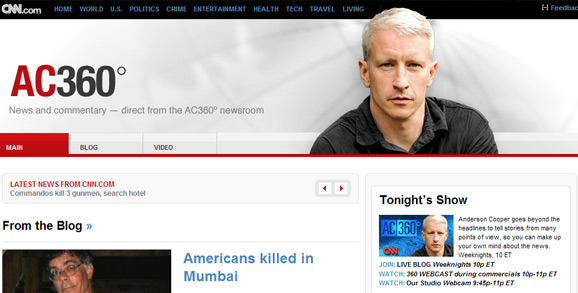
A hybrid blog and news portal for CNN commentator Anderson Cooper, his 360 blog uses effective magazine/editorial style grouping for easy scanning and injection of lots of info onto the main page. What’s relevant about 360, from both a design and SEO perspective, is the balance of blurbs of content along with lists of links. The design could be kicked up a notch by offering a featured video near the top of the page that can play directly on the page without requiring the user to navigate elsewhere. Cooper’s reporting often features compelling visuals, and some of these could be turned into still shots in a gallery on the front page to help further add balance against the text and links.
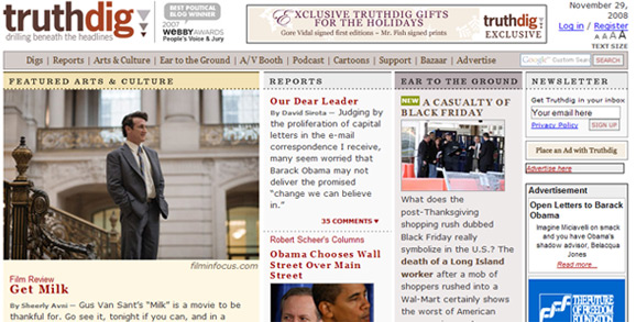
Truthdig puts a huge chunk of change of content on its front page, but its visuals and color blocking help create a more structured approach. The use of varying sizes of pictures helps move the eye down the page, and each section of the magazine is easily deciphered. More padding and breathing room would help the design feel less chaotic, but Truthdig’s designers may have purposely chosen a tight approach, with little white space, to convey a sense of urgency.
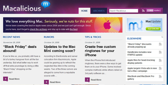
Macalicious positions itself as a news site, but any blog with a rich amount of content can take cues from its approach. Macalicious is more a true magazine layout approach than Problogger and Truthdig, and it packs a lot of info on the front page without requiring us to move the mouse around much to see it. If you have a blog with a small amount of very distinct categories, you might consider emulating Macalicious’ top content, where they highlight recent news, then content from two other main sections. The photos below the content point to a Flickr feed, and if you run, say, a travel blog, a similar solution could add great visuals to your page and enrich your entries with parallel visuals that make your readers experience more comprehensive.
Macalicious is a prime example of the content dictating the direction of the design. Macs, as a topic, are fairly narrow, but within that are several primary areas of interest. It’s a big enough topic to require a strong organizational approach that the magazine layout provides, but it’s narrow enough that it doesn’t suffer some of the scrolling issues that TruthDig presented.
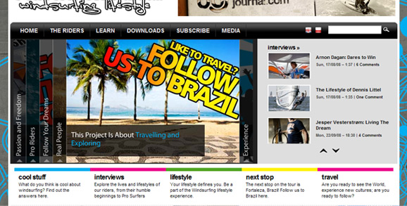
This topical blog and lifestyle magazine dedicated to windsurfing is interactive as all get out, and pushes visuals and graphics in a way that really leverages the strength of a magazine layout design. Although a fair amount of scrolling downward is required on the front page, the content is blocked so effectively that it mimics the way a magazine’s table of contents might feel. This is magazine style taken to its true potential. A cooking blog could take this site as inspiration for injecting lots of food visuals, some tutorial videos and organization by theme/category. A fashion-oriented blog could also blow competitors out of the water visually by utilizing this kind of structure. Just make sure you have enough interesting imagery and some micro content to support a framework this robust.
Hopefully these varied approaches to magazine style get your own creative juices flowing when it comes to potential for your own blog. Although a magazine layout approach can be overwhelming, it also offers an opportunity to expand possibilities for your blog and inspire ways to use new social media and interactive technologies that will better engage your readers and help your site look more rich in content and style.
If you’ve seen any great blogs designed in magazine style, we’d love to hear about them, and your thoughts about the blog’s design and organization.






Really nice work. And i have nothing to add more. The content itself is speaking well!
Really nice work. And i have nothing to add more. The content itself is speaking well!
[…] the original here: Magazine Layout for Blogs: Inspiration and Caveats This entry was posted on Friday, December 12th, 2008 and is filed under MagazineThemes. You can […]
[…] bookmarks tagged layout Magazine Layout for Blogs: Inspiration and Caveats saved by 3 others KamikazieLX bookmarked on 12/14/08 | […]
I think the magazine layout does look pretty cool but I see what you mean about if it’s not updated frequently that could be a downside. I particularly like the truth dig one.
-Gerald Weber
I think the magazine layout does look pretty cool but I see what you mean about if it’s not updated frequently that could be a downside. I particularly like the truth dig one.
-Gerald Weber
Thanks for featuring my site – http://www.followthewinds.com !!
Really great article. I love Anderson Cooper’s site; very clean. Bit of a difference to mine!
Thanks for featuring my site – http://www.followthewinds.com !!
Really great article. I love Anderson Cooper’s site; very clean. Bit of a difference to mine!
[…] you read our prior article about magazine style blog design, you hopefully got a good overview of what magazine style design on the web looks like, and […]
My mom runs an online company and is just starting up her own blog. It can be found off her website http://www.safepace.com If anyone has advice on how she should design her blog for her unique product and industry, please check it out and let us know! Thanks- ErinRose
My mom runs an online company and is just starting up her own blog. It can be found off her website http://www.safepace.com If anyone has advice on how she should design her blog for her unique product and industry, please check it out and let us know! Thanks- ErinRose
One of the things you didn’t touch on that I think is important is advertising. Magazine style sites, I believe, make it easier to create advertising sections that are more fluid with the site.
One of the things you didn’t touch on that I think is important is advertising. Magazine style sites, I believe, make it easier to create advertising sections that are more fluid with the site.
We are currently working on http://www.hair.ph. It is not through yet since we haven’t installed the necessary plug-ins. For this blog we used the magazine layout since there will be several features on hair. By Feb, we will see how far we’ve gone with the site development…
We are currently working on http://www.hair.ph. It is not through yet since we haven’t installed the necessary plug-ins. For this blog we used the magazine layout since there will be several features on hair. By Feb, we will see how far we’ve gone with the site development…