

Minimal design is the clearest and the most compelling when it comes to conveying an idea or a concept.
This post looks at minimal design in billboard advertising: 10 (almost) blank but really impressive billboards:
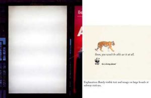
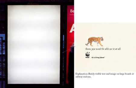
These billboards have tiny animals on them. The copy reads, “Soon, you won’t be able to see them at all.”


The target is unclear but the message is definitely compelling:
by Armante
The billboard is empty but it says that all!
October 1st was International Older Persons Day. So, in an effort to remind younger Scots that pensioners are people too, the Scottish government installed these posters in Glasgow, Edinburgh and other cities.
Another blank billboard with clear message:
Only such a strong brand as PlayBoy can afford to create such self -explanatory billboards.
The billboards were part of a Cartoon Network ad campaign for Foster’s Home for Imaginary Friends.
by Michael™
View Comments
I apologise, but, in my opinion, you are not right. I can defend the position.