If you are a smart shopper, it is not that easy to persuade you to actually buy something. There is the science behind how the products are organized, labels are written and sections are ordered to guide you through to making a purchase. That’s a wealth of tricks based on psychological theories and practices that in the end “convert” you from a regular visitor into the buyer.
One of the most powerful methods to appeal to a potential buyer is applying color theory to (e)commerce. Has it ever occurred to you why you feel safer in one store and more energetic in another one? Have you ever noticed that landing on some web page you feel like clicking some button/link and keep browsing the site? While other pages prompt you to stay and keep reading? To some extent, this might be the choice of colors for the page elements.
Color is believed to be one of the most powerful elements of design for web sites, direct mail, ads, and other marketing materials. It carries meaning through associations and/or your body physical response. Color associates can vary from country to country but in Western culture they are basically the same.
So don’t let (online) sellers affect your decision by showing you what you want to see. Let’s see how color choice may affect your shopping behavior and habits – for you to be able to buy with a cool head.
Color Prompts You to Buy
A regular shopper in North America is likely to respond to color choice the following way:
| GROUP | COLOR | HOW IT MAKES YOU FEEL | WHY IT INFLUENCES YOU | WHERE YOU ARE LIKELY TO SEE IT |
| warm (exciting) | Red | Energetic, hungry | It activates your pituitary gland and increases your heart rate | Logos and calls to action |
| Orange | Enthusiastic, cheerful | It is a combination of aggressive red and cheerful yellow | Calls to action (subscribe, buy, etc) | |
| cool (calming) | Blue | Secure and trustworthy | It is associated with sky (therefore universally liked) | Money and business related websites (banks, loans, etc) |
| Green | Stable, wealthy (deep green) | It is the easiest color for the eyes | Testimonials, founder’s story, etc. Finance related websites (e.g. Forex related) | |
| Calm (light green) | It is associated with spring and nature | Entertainment and leisure related websites |
(based on my other table on color branding)
As can seen from the above table, red and orange colors are most often used to encourage your action, i.e. to prompt you to buy something or subscribe to the newsletter (and become the customer later on).
Green and blue, on the other hand, are “supporting colors” that make you feel secure and safe thus entrust the seller with your money.
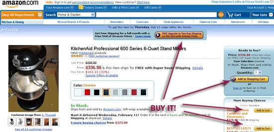
See how much Amazon.com wants to talk you into buying something using dark and light orange color:
Color Affects Your Shopping Habits
It is also believed that color affects shopping habits. Look how different shoppers may respond to various colors:
| COLOR | WHO RESPONDS BEST |
| Red | Impulse shoppers |
| Orange | |
| Black | |
| Blure | Budget shoppers |
| Pink | |
| Sky blue | Traditionalists |
| Rose |
Color Depends on the Season
Another way to appeal to your eye is to choose colors on occasion. Many e-shops change design from season to season to make you feel more at home. You’ll see more red/orange designs in autumn, blue/white – in winter and green websites in spring.
Besides, it is a frequently-used trick to change colors depending on the approaching holidays: green and red combination is associated with Christmas (as they symbolize Christmas tree and Santa Clause); red is often used on St Valentine’s day (as that’s the color of heart and love), orange is associated with Halloween because pumpkins are a big part of that holiday (of course, all the aforementioned associations may vary from country to country).
So on visiting a website or store on a holiday and seeing familiar colors, you are more likely to stay as you feel comfortable.
Image by Pink Sherbet Photography


