
Colors are everywhere and their impact on us shouldn’t be under-estimated. Our nervous system requires input and stimulation. And color choice is the best way to help it.
Colors can change our mood, make us work or feel tired – imagine, your room colors may be the reason for your bad productivity or lower creativity! The human eye sees about 7,000,000 colors.
Certain colors and color relationships can irritate, cause headaches, or make you feel sick. Other colors and color combinations are healing and soothing.
Consequently, the appropriate use of color can maximize productivity, minimize visual fatigue, and relax the whole body. Here are some basics to start from:
| Color | Physical background | Feelings | Effect on productivity | |
| Thermal / warm colors (stimulate and raise blood pressure) | Red | Red raises blood pressure, increases breathing, heart rate and central nervous system functioning | Makes people feel hungry; subconsciously symbolizes dominance | Makes people more cautious and detail-oriented; => Make people’s work more accurate |
| Cool colors (calm, ease inflammation, and lower blood pressure) | Blue | Blue lowers blood pressure, the pulse rate and body temperature | Least appetizing; calming | Boosts creativity |
| Green | Green in the center of the spectrum has a stabilizing effect on the human system as a whole. | Relieves stress, makes you calmer | Researchers have also found that green can improve reading ability |
Now, just a few details to support the data listed in the table:


It may look weird that while making you more energetic and excited, this color also makes you more productive and attentive to details. This phenomenon is explained the following way:
“When you feel that the situation you are in is problematic,” said Norbert Schwarz, a psychology professor at the University of Michigan, “you are more likely to pay attention to detail, which helps you with processing tasks but interferes with creative types of things.”
By contrast, when people are calm, balanced and in a happy mood, they are more creative and less analytic. Hence if you need to get more creative, blue is the right choice for you. Blue also suppresses appetite, so if you have bad time concentrating because of the frequent breaks for some snacks, surround yourself with blue and you will get more organized.
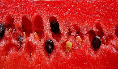
Want to see for yourself, compare then: Which one looks more delicious?
and
Which one makes you more relaxed / energetic?
and
Post images by janerc, FlickrJunkie, ruurmo , colormatters, flod, B G
More on colors: How Color Choices in Stores Can Influence Your Shopping Decisions
View Comments
The title seems to have used "effect" where "affect" would be more in line with the content of the article.
now the title has 'affect' ?
nice try correcting grammar, but "effect" is indeed the correct use here.
No, it's not. Not when the commenter left that note at least. It was simply corrected before you commented, deciding to criticize them. You can see it in the URL -- the original title was used to generate the permalink using "effect," and changing it after the title correction would have screwed up incoming links and such so it was left alone. Don't be so quick to criticize. (And yes, I know this is a reply to an older comment.)
Sorry, but "effect" is a noun; so "affect," a verb, would be correct.
Yes, we've established that and it's been corrected in the page title. Thanks. :) As noted previously we didn't change it in the permalink because it would have affected incoming links at the time, giving visitors a "page not found" error.
To really prove the point that color affects how appetizing something is, you should really have two identical photos of a food but shown in different colors.
Here there are other factors other than just color that make the rice appear less appetizing than the strawberries: the uninspired composition of the image, the seaweed skin, and the fact that they kind of look like maggots ...
Haha
rofl!!!
Yes, traditionally scents do affect your productivity. Read up on aromatherapy to know more. I'm a writer and often use essential oils. For example, if it's a cold day and I'm sluggish and having difficulty concentrating I will burn some rosemary essence in an oil burner. If I'm very tense and this is impeding my work then I'll turn to lavender, and so on.
This is so much true! And not only about edible products, but also about consumption products. Thanks for the interesting read on a fresh topic.
Not very detailed is it? Never the less I did change my computers desktop to red. I'm such a procrastinator I'm even thinking of painting an office wall red. That will put off any "real" office work for half a day or more!
I'm trying to think of where I've seen something more useless than this "study" and its advice. Nothing comes to mind. Has anyone seen offices colored in any of the three primary colors of light? And does anyone believe that red, the color of blood, increases appetite more than other colors? Or that blue lowers appetite? Dieters would be painting their entire environment blue. Personally, I found the brown and blue concoctions more appetizing than the close-up of strawberries. I also found the red photo with the melting gel tower more relaxing than the blue photo with the vivid flower-like (shuriken-like?) image on a white dust background. Of course, I could be atypical in regards to color.
The skeptic in me says this type of information doesn't pass the BS detector test.
i can think of something more useless. spending the time to write a full paragraph to spite someone's research. oh, i'm an art consultant and there are plenty of offices with bright blue red orange green and yellow walls. maybe the lack of color in yours is giving you a bad attitude :)
Orange is bad. Really bad. I used to work in a place with orange/yellow patterned rugs and orange striped walls. I can't think of a more unpleasant environment. It made people narky. Someone obviously thought it would keep us awake. Like work isn't bad enough in the first place. :P Now, blue, I can work around, all mellow and yet productive.
Orange makes me sick. If it was neon kind of red mostly orange color I would want to throw-up, get dizzy, irritated, and feel very week. I would feel that way anywhere 20 mins to 2 hrs depending of exposure. I've always been that way. Don't know why???? Any Ideas???
Ann whats your last name i need to site u for a project.
Ann Smarty
Ann, I really need your last name also. I need to cite it for a paper. It would help a lot.
Interesting. I'll try to look at blue objects from now on when lunchtime feels too far away...